
TLDR: Purdue Hackers ran the largest creative-technical demo day in the Midwest… out of a coffee shop.
spill ≋ is a low-friction, high-chaos demo day for student projects, held in a coffee shop.
In a tech culture obsessed with polish, we wanted to celebrate the opposite: duct-taped prototypes, late-night builds, and ideas that are still figuring themselves out.
We transformed Vienna Espresso Bar into a public showcase for 23 creative-technical projects, proving that when you make room for passionate imperfection, people show up.
This case study documents how we designed a visual and physical identity that embraces mess instead of hiding it.
why spill ≋
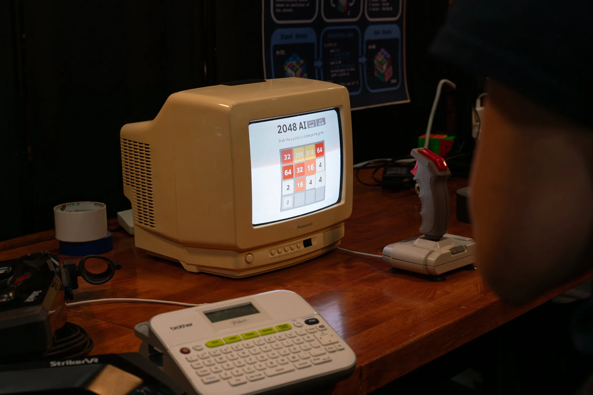
spill ≋ is a low-friction, high-chaos, pop-up demo day where students showcase the things they’ve built this semester—robots, experimental art, silly hardware, accidental masterpieces—you name it.
It’s the second rendition of the Purdue Hackers show. Our first was BURST ✷, held in an art gallery with 9 projects. This year, we grew to 23 student projects—more than doubling in size and proving that when you make space for the messy and imperfect, people show up.
We hold these shows because:
- Most student creativity never gets a stage. It’s hidden in dorm rooms because it feels “too messy” to show.
- Demos stay buried within our club, never reaching a wider audience.
- Prototypes are dismissed as “too early” or “too rough” to show off.
spill ≋ embraces the imperfect, the half-working, the duct-taped, the “it worked yesterday!” We made a space where tech and art feel alive, public, and human.
by the numbers
Why is spill ≋ so cool, just with numbers? We had:
- $5,621.29 spent on microgrants for projects
- 200 attendees showed up and got a drink
- 27 poster variations hand-crumpled and posted across campus
- 23 projects showcased (up from 9 at BURST ✷, our previous show)
- 1 coffee shop transformed into a demo floor
photos
Before we dive into the visual identity as well, here are some of my favorite photos:


You can see more on our website.
visual identity
spill ≋‘s visual system was directly inspired by Purdue Hackers culture: messy, wacky, playful, and experimental. The identity needed to feel analog, intentional but never overly clean—something that feels made by a student.
aesthetics
Here is a moodboard the design team came up with during one of the Hack Nights in early September:


Here’s an initial poster I made while still exploring what we felt worked.

We chose a palette built around warm browns, neutral off-whites, and greens, pulled straight from real coffee and matcha spills. The browns feel warm and inviting, the greens add a playful contrast, and the off-whites keep everything readable without feeling sterile.
typography
For the typography, I went forward with AUTHENTIC Sans, a typeface that feels modern and technical but still has an ever so slightly raw and straightforward honesty to it, as our main typeface.

I felt that this anchored the identity by grounding chaotic visuals, keeping everything readable even when noisy, pairing nicely with organic textures. It’s technical enough to feel like it belongs in a hacker space, but human enough that it doesn’t feel like it came from a design system template. The slight rawness in the letterforms mirrors the rawness of student projects—polished enough to be legible, imperfect enough to feel real.
logo and symbol
Late October, one of our designers, Natalie, came up with the logo during a coworking session:

The second one ended up becoming our logo!
The idea came from a tweet she’d seen about fitting text into shapes—you divide the shape into sections matching the number of letters in your word. She had the sudden idea to try it with a splat shape, since the theme was “spill.” The result: letters that feel like they’re mid-splash, frozen in the moment of impact.
“basically if i didnt doomscroll it probably wouldnt have happened…never let anybody tell you doomscrolling is uneducational /j” —Natalie
The wavy symbol (≋) captures the essence of spill—liquid in motion, something in flux, not yet settled. It’s playful and abstract enough to work across applications while staying distinctly spill.
digital experience
website
The website also reflects a lot of this brand identity, using grain overlays, “highlighter” on certain words and a messy collage background. There are also elements of play within the interface—several coffee stains, an interactive ticket, and an overall design that feels tactile and physical despite being digital.

The site itself feels like a coffee-stained page that someone opened up and started writing on. We used actual coffee stain textures, positioned them organically, and let them break out of the grid. The highlighter effect on key phrases makes it feel like someone was annotating the page, marking what matters.
Explore the site for yourself here
People interested in spill were encouraged to RSVP through a ticket button. As users RSVP’d, they were routed to a ticket page. I had Lilian Zhao write about their work regarding the ticket page.
tickets (written and made by the lovely Lilian Zhao).
The main motivations for making the tickets and customization page were just to have an easy way to promote/share the event, giving people a personalizable digital token they can keep and share, and also just having a fun little easter egg for the site. We saw a lot of examples of this kind of experience for other events but particular we took inspiration from the 2025 Socratica Symposium ticket customizer.
For the ticket designs there weren’t any specific inspos but we looked at a lot of coffee shop packaging designs and were going for sort of a “textured” feel. Overall directions were this coffee house vibe (cozy, loose/flowy, messy/imperfect) and incorporating that with digital data-encoding elements commonly seen on tickets (barcodes, pixel patterns, mono font strings).

(There were so many iterations!)
This design direction can be seen in the UI of the site itself as well; users can choose from 8 different ticket design variations, each corresponding to a different “drink order” such as matcha latte or cappuccino. Our main colors (green and brown) were also incorporated as 2 ticket “flavor” variations (tea vs coffee) that users could choose from. Other than that users could further personalize their ticket with little sketches through a “crayon”-like drawing functionality, along with typing a message onto a sticky note.

We also aimed to incorporate a smooth UX flow to and from this ticket page from the main site; users would be automatically redirected after RSVPing, and can easily share a link to a page with their customized ticket image, from which viewers can RSVP and access the main site themselves.
physical experience
posters
We purposefully built a brand out of messing up a table; creativity is messy, and spill ≋ should be too.

We had 27 variations.
Each poster uses several textures of coffee spills, smears, drips, rings, and splatters, alongside deadpan, playful, and sometimes unhinged one-liners. Each poster was also hand-crumpled by Saahil and me. We spent hours putting them up around campus.


Across campus, 27 posters met students in hallways, study lounges, cafés, and engineering buildings, whispering:
“hey… messes are allowed here… come spill something too”
Fun fact: Multiple people specifically approached me about the “Are You a Mistake?” poster.
brochures
Alicia designed the brochures—printed guides that felt like zines you’d pass around, not corporate pamphlets. They mapped out the projects and gave attendees a physical artifact to take home. Thank you Alicia!

prioritizing information
The main priority was the projects themselves. Each of the 23 projects got roughly equal space with a custom graphic. To fit everything, Alicia had to cut some decorative elements—like hand-drawn borders around the “menu” text. She also added a map of project locations on the inner fold.
the illustrations
The back cover features graphics representing the creative process through coffee/tea items: a kettle, matcha bowl, utensils, and a pitcher—all leaning or tipping toward a small sprouting bud. They’re spilling… to water a plant.
For the project illustrations, Alicia worked directly with project owners. Some had CAD models ready (like qter); others were still assembling their projects (like Beacons, where Jack provided a hand-drawn sketch). For other projects, she drew something more abstract that matched the project vibes rather than a literal representation.
texture and legibility
The brochure has a paper-y grain/noise overlay throughout—tactile without being distracting. Text and graphics got slight texture warping, but Alicia preserved the spill logo’s clean shape. For legibility, she chose lighter tones on brown backgrounds and darker tones on beige. Project descriptions stayed clean (no texture warping) since the smaller text needed to stay readable.
tote bags
I designed the tote bags using Natalie’s logo with text underneath: “spilled coffee, real projects:” followed by the date. The design was intentionally simple and one color—clean enough to let the logo speak, minimal enough to feel like something you’d actually carry around.
But half of them got the hand-drawn treatment. During one Hack Night, Alicia and I (plus whoever happened to see the fabric paint and tote bags lying around) drew on about half the bags, making each one unique. Some got extra doodles, coffee splatters, or chaotic additions—turning mass-produced merch into one-of-a-kind artifacts.
At the event, Ray bought a nice clothing rack that held all the tote bags near the coffee bar in Vienna.


venue and logistics
choosing the space
Something heavily debated was our venue. Before we landed on Vienna (which was the best possible choice, in my opinion), we were considering Eleventh House and Fuel; each had their own pros and cons.

We held spill ≋ at Vienna Espresso Bar, a cozy coffee shop that felt like the perfect home for our chaotic showcase. The intimate space forced people to get close to projects, to talk to creators, to actually engage.
the name
Since we focused having this year’s show at a coffee shop, we had to think of an event name that matched what we were going for. We considered a few names, like drip and brew. spill ≋ stuck because it captures everything we wanted: accident, looseness, curiosity, and the beautiful chaos of creation. It’s not about perfection; it’s about what happens when you’re making something and things get messy.
drink menu
We collaborated with Vienna to offer drinks on the house, from americanos to flavored matcha lattes. We had to make sure the menu had drinks that:
- People actually liked
- Were feasible for two baristas to make for around 200 people in 3 hours
The free drinks were meant to be a part of the full experience: Grab a coffee, find a project that catches your eye, talk to the person who made it. The casual setting made demos feel like conversations rather than a formal presentation.
We displayed the drink menu both at the front of the store and right by the coffee bar.


outro
spill ≋ looked the way it did because the people making it were truly passionate about it. About the event, about the details, and about other’s work.
We’re always thinking of bigger and better things we can do for the next Show. I hope to see you at the next thing we dream up!